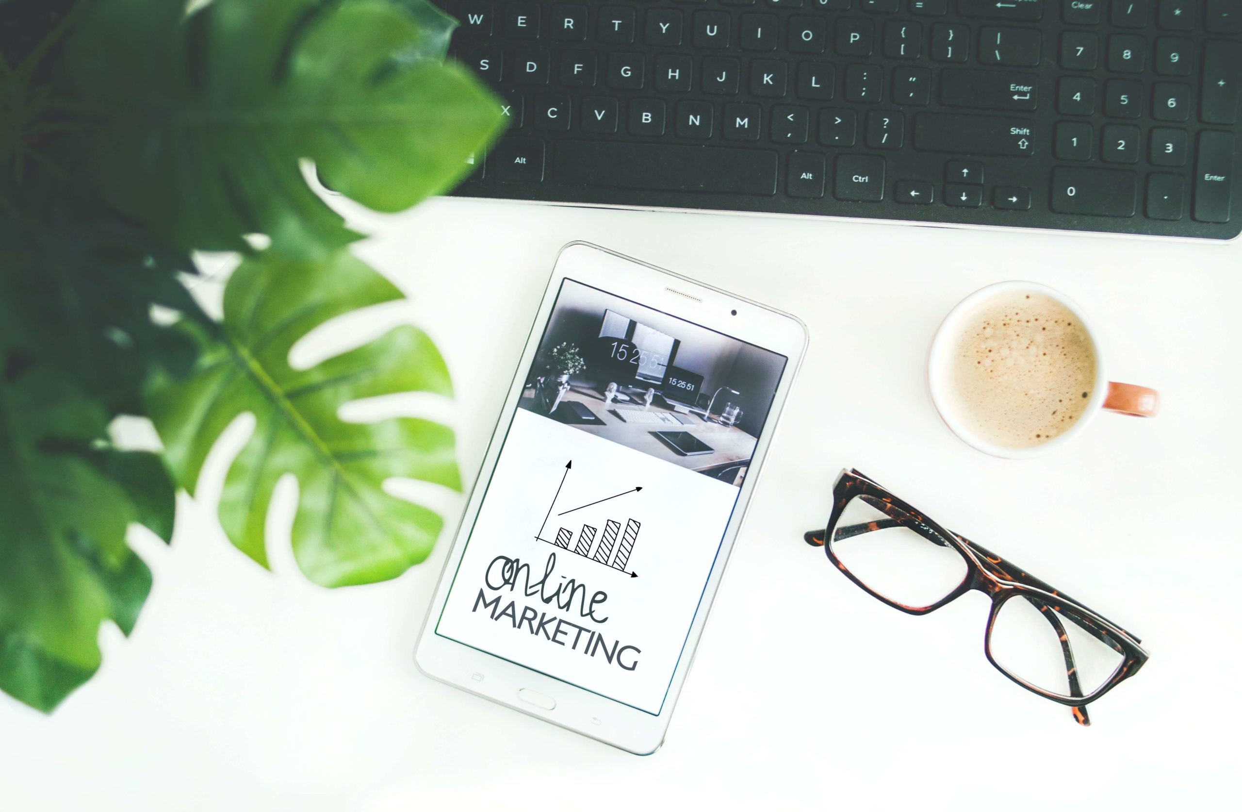
Best Practices For Call-To-Actions For User Experience
Proper attention should be given to call to action buttons, they are the driving factors that help you convert your visitors into actual clicks. Call to action buttons as it is related to user experience are those elements in your landing page that solicit or demands action from the user, so whenever you come across a button that asks you to learn more, downloads now or sign up now, that is simply known as a call to action button.
This is to say that a rich knowledge and understanding of how to color, how to scale, what language to make use of, and so many other factors should be possessed by the web designers in order to fully harness the potentials that the conversion rate can yield. The process of doing this is not complicated but requires some level of creativity and forethought in order to create a potent call to action buttons.
Best Practices for Effective Call to Action Buttons
As I said earlier, call to actions button as related to user interface requires some level of creativity, forethought as well as planning and as such should be embedded in the prototype stage of the information structure of the web design so that every relevant information needed to create a catchy call to action button can be meticulously addressed.
Call to Action Practices That Work
- Text should be impulsive: you must try as much as possible to avoid boring and old English words in your call to action button, words like ENTER, SUBMIT, SHOW should be avoided in this 21st century once it concerns call to action buttons. Instead use GRAB, GET, CLAIM TRY, etc, these are words that demand impulsive action. Attention should be given to the kind of product or brand you are trying to promote because this is not a one works for all type of stuff.
Guidelines in Using Text
- Use plain but direct language that is easy to comprehend
- Use bold and large fonts for the main text
- The language should demand fast action
- Color and Shape: to make buttons more inviting and attracting, attention should be given to colors and the shapes of the button. Human dispositions and moods readily respond to the visual elements surrounding them. While choosing your color scheme and shapes bear in mind that once the eyes behold them, information will be rapidly sent to the brain which in turn triggers the secretion of hormones by the endocrine system which is solely responsible for a shift in emotions and moods.
This is a short color and shape guide
- The call to action buttons are supposed to be the largest buttons in the webpage
- Make the smaller call to actions buttons stand out by using contrasting colors for them
- Use colors that are less distinct, this will make the big call to action buttons to fit in better
- The color and shape used should be able to attract attention no matter how sophisticated the web design is.
- Find A Prominent Position: I don’t think that anybody wants to keep the call to action button in a position where it will be hard to find, but this area is also very vital, call to action buttons should be placed in very prominent positions where they will stand out, placing it at the tail of the landing page will kill your site and will not bring forth any conversion, on the other hand, top of the landing page does wonders, center of the webpage is another good location.
Guidelines
- Do not let the call to action button to be choked by other content on the web page.
- Inculcate the principles of rule of thirds and golden ratio while determining how much space to add
- Negative spacing avails your call to action button space to be unique from other contents in the webpage
- Create a Sense Of Urgency: There is something you should know about creating a sense of urgency, the more time you avail for your visitors to think about the offer, the more likely you will get a NO as an answer, this does not mean that you should deceive your visitors but the call to action button should be able to create the impression that time is not on your visitors side and that they need to act fast. That means that you need them to act on the spur of the moment. As we said these tips don’t work for brands, brands with high prized items may not get the best out of this when compared to free or low prized stuff.
Urgency Guidelines
- The call to action button should motivate the visitor to act instantly
- The call to action button should create no room for inquiries
- Be genuine and authentic, do not deceive your visitors.
- Tell the visitors what to expect: As the case may be, use the call to action button to throw more light on information that they need as it concerns the call to action button. Example if it is a free trial call to action button, then you can tell them how long the free trial will last, if it is a download button, then the size of the file, as well as the version of the file if necessary, should be given, so you see that if this is done, there will be no room for visitors to hesitate before clicking.
Information Guidelines
- Only add information that is relevant to user experience
- This information is not relevant to all call to action buttons but works better for download and free trial buttons.
- The information should not overshadow the main call to action text.
Conclusion
After all, said and done, testing should be done to ascertain whether the call to action button in the user experience is yielding as much conversion as expected of it. conduct A/B tests on them regularly so as to improve on your CTA button, while doing this, it is recommended that you divide the visitors into groups before showing them the progressive test results, with this you can determine which CTA is more efficient and which should be improved on.
After reading this blog, you should know that color, size and other factors mentioned above have a high impact on the call to action buttons and therefore each should be tested individually to ascertain which works best.
Call-To-Action That Work: 10 Examples To Test
As an internet user, you must have come across pop up boxes that tend to gently persuade you to click on them or tries to advertise the juicy part of what you are looking for and ask you to either buy now or learn more, these are call to action ideas, they are there to make the visitor or the reader to have a sought of commitment to your brand in different ways either by buying your product, investing in your idea or service, following you on social media or joining your email list. The sole aim of these call to action is to establish leads and create a high conversion rate for your website so that in the end, you can make sales.
The Importance of Good Call-to-Action
Call to action generally automate and seamlessly transforms your marketing efforts into leads and sales while you are not working from street to street trying to do the gentle persuasion on your own, they can come in the form of bars, exit intent popup windows or small automated dialogue boxes that starts up a chart and then transfers you to a real person.
Having said this, I will go ahead and give you some call to action ideas that have been tested and trusted to work for home services, real estate, and medical rehab brands.
- Download now: This is like a hot cake that never gets cold, it works so well especially when you have a service or product that you want to sell and you want to take the visitor to the checkout page or sales page. It is very effective and in those two words, it tells the visitor straight on what to expect when he or she clicks the call to action button.
- Try it for free: Everyone loves the word free, some people have grown to give less trust in the word free, but then for a brand to offer their product or service for free shows how credible and trustworthy the product is, once it is marketed well with a compelling phrase added to it, the try it out for free yields a lot of conversions, Netflix has used this particular call to action to turn millions of visitors into customers and sales for real cash.
- Talk to an expert now: Ok this goes miles for medical brands and real estate brands and almost any brand that deals with professionals, getting to book an appointment with a professional these days can be so tedious and in most cases, everyone wants to get some professional advice as to what to do next. This is why this call to action button does wonders. It turns visitors into instant callers but I must warn you, be sure that you have 1,001 answers to 1,000 questions because if this does not go well, you will lose that visitor and other prospective visitors forever.
- Learn More: This cannot be overlooked especially by people in the medical field. I chose to say the medical field and rehab because many people wish they can gain knowledge on certain things that are affecting their lives and well-being. Therefore offering patients and consumers an accurate opportunity to gain relevant knowledge about medical conditions and alternative treatments can turn visitors into dedicated customers and will even grow your email list and give you lots of cash.
- Limited Offer: Here you create a rush in the mind of your visitors, you let them know that there’s something they will like to have, but that it is not going to remain there for long, so this is the time to click, this one really works as fast as the word fast, so you’ll get people hurrying up to click so as not to miss the chance.
- Order now and receive a free gift: Gifts are always worth more than their actual price, so many people have bought one commodity or subscribed for one service because of the gift that was fixed to it, free gifts and consolation prices are good sales incentives. This must not be a physical gift, it can come in the form of a discount on next purchase or an immediate purchase, it can be a free premium membership for 1 month, and you just have to be creative with it.
- Request your FREE quote today: Some people live by seeing and believing, so they prefer getting a free quote in order to make a more informed decision, free quotes cost little time and no financial commitment but gives information that is enough to generate leads and sales. So whether you are a broker, real estate or home services brand, giving your visitors a free quote will turn more than 50% traffic into sales and return customers and can also grow your email list.
- Buy now and get free shipping: Shipping costs is one of the major challenges of purchasing goods online. Consumers will always prefer to transport themselves through the city to acquire their goods in person than to not only pay for shipping but also to stand guard waiting for it to arrive safely in one piece. The good news is that most customers won’t mind waiting for their goods to arrive so far they don’t have to bother about shipping costs. This is the reason why firms like Amazon deliver goods without adding shipping costs over a specified dollar amount.
- Money-Back Guarantee/ Free returns: This combo is well loved by customers and shows how reliable and how firm a company stands by its products and services, this assures the buyer that the product is good and if by error there are some discrepancies, many customers may not really want to initiate the return process and even if they do and because of the free returns and money back guarantee. They feel more satisfied when the company fulfills its promises.
- Call toll free: This is another sure call to action. It helps you reach more visitors and allows you to market your product from where ever you are. People will feel free and more comfortable to call you up knowing that they are not paying for the call so that they can explain to you what they want and also get all the necessary details they need. This is a magical call to action because you can lock down sure deals as fast as the call drop through this call to action.
Guide on best call to action tips
- Always include a possessive adjective like “Mine or your” in your call to action statement
- Use timelines to create urgency in other to encourage clicks
- If you lack creativity, use a call to action software
- Use words can induce curiosity and enthusiasm
- Give useful insights I the call to action
Last Mention
Call to actions is a trial and error type of activity, you can only get better by trying different approaches until you earn what works for you, the aim is to convert visitors to loyal customers, if that's the case, it needs seriousness and practice, failure is part of learning when it comes to call to action campaigns. So spend the time to research ideas and also be sensitive to what gets you more clicks.